It never ceases to amaze me what people ask me sometimes while I’m painting out of doors, or with a local art group. People will come up and say “what colour is that?” and what did you mix it with?
As an artist, when I am choosing colours to mix or apply, I’m not thinking of their names at all. I’m thinking is it a warm colour or a cool colour, how strong shall I mix it, do I want it to recede into the distance or stand proudly in the foreground? So the last thing on my mind is the name of the colour. The only time I need the name, is when I run out and need to buy some more of it.

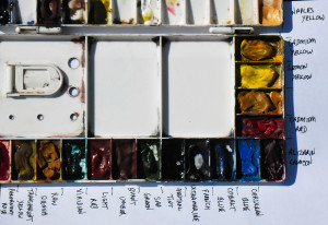
If you really are interested though, here’s a description of the colours I use most:
Starting from light to dark, and cool to warm:
Lemon Yellow (cool) – Cadmium Yellow (warm)
Alizarin Crimson (cool) – Burnt Sienna – Cadmium Red (warm)
Cerulean Blue (cool) – Cobalt Blue – French Ultramarine (warm)
By careful mixing, I can paint anything with only these EIGHT colours, and often do.
Of course, over the years I have been tempted by a few more colours, but only very rarely use them, they are:
Naples Yellow (warm), Transparent Yellow, Raw Sienna (warm), Paynes Grey (cool), Sap Green, (warm), Light Red (warm), Permanent Rose, Burnt Umber (warm), Viridian (cool), and Prussian Blue (cool).
It is important to get to know your colours really, really well, especially which are cool and which are warm in colour temperature. After a while it comes naturally, but If I try a new colour, I always make a chart with all the possible mixes, and carry it with me until I really understand it. If you have ever tried painting, you will know that mixing greens can give so much trouble to an artist, and a poor choice of greens can ruin a painting completely.
